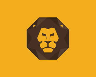
Description:
Techlion is a corporate branding project between technology and "Panthera Leo" The distinctive look of the Lion as well as the color chosen create the main approach for the branding outline.
As seen on:
Lemongraphic
Status:
Client work
Viewed:
5396
Tags:
lion logo
•
name card
•
qr code
•
typography
Share:


Lets Discuss
If you were to register this with the USPTO it probably would not fly. Marks are registered in black and white and it would be a deadringer of this one. http://logopond.com/gallery/detail/160145
ReplyThanks, logomotive. That is good advice.
ReplyHere is my original design:
https://rajasandhu.com/best-logos/raja-sandhu-style-guide-logo-grid.png
And in use by the company:
http://netmonastery.com/
First of all, great design logo for Net Monastery. The only similarities i find for Techlion and Net Monastery is the octagon shape. Our Lion features and corporate colours used are totally different from Net Monastery and we have a ear for the lion too. A triangle which of brown colour use to create the beveled effect of the techy surface for the lion hair. Corporate color are used with the original color of the lion and safari. Yellow and Brown.
ReplyWhy we choose Octagon, is because in Asia, In Chinese Octagon have a symbolic meaning of Infinity and Regeneration of sales. As Techlion. Is an online store selling tech items. This Chinese Hexagrams shape will help in business as well as sales. http://www.symbolic-meanings.com/2008/05/24/symbolic-meaning-of-octagon/ which we also consider this as Feng Shui
An example of this incase you have not seen this before.
http://3.bp.blogspot.com/-TKKUgLW0T9c/ToV76c69SqI/AAAAAAAAAac/54Vy1yZhTzM/s400/Fu Xi trigram arrangement.png
Hope this clarify your question.
Thanks
Please login/signup to make a comment, registration is easy