nalanta v2.0
by rambal • Uploaded: Apr. 28 '08

Float
(Floaters:
2 )
Description:
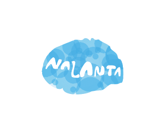
nalanta - knowledge hub. It's a Portal providing Knowledge base solutions for various softwares.
I'm looking for your valubale comments.
Status:
Nothing set
Viewed:
1646
Share:


Lets Discuss
I like the simplicity of the design. A couple suggestions though...**• The blue circle is probably a little too big. You could also move it up about 20 pixels.*• I don't think the type matches the icon very well (maybe you should go with a type that's a little softer.)*• A few too many petal shapes in the blue circle.**It's almost there. Just a little more work!
Reply%25u2022 are actually bullets!
Replyi like how the extension on the l %26 t are holding up the sphere... but i think you need to tighten up on the kerning. I dont personally think the font dont go well.. i think its quite nice %26 matches well.. but thats just my opinion.. i do agree that the portal could be reduced somewhat though %26 maybe by tightening up the space between the letters you could do that while still maintaining the concept you have now... over all it has a very nice look %26 an appropriate feel to it.
Replyagreed the spacing between the nta is way off... i like spiffy's comments of moving the ball up a lil' and making it a touch smaller, as well as looking into simplified sphere shapes. I don't have as much a problem with the type, i think its working quite well.
ReplyBeautiful mark even if I don't like the type.
ReplyPlease login/signup to make a comment, registration is easy