cmykgarden
by rambal • Uploaded: Dec. 12 '07

Float
(Floaters:
21 )
Description:
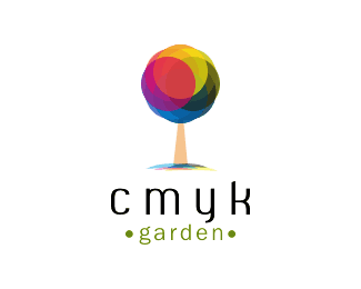
cmyk garden is an online portfolio for all print works of the client. They are going to use the logo only in the web.
As seen on:
http://www.cmykgarden.com
Status:
Client work
Viewed:
12374
Share:


Lets Discuss
In this logo I had tried something new in terms of mark and type. most of them feels that type doesn't fit with the mark. Sometimes I go with the majarity peoples opinion.%0D*%0D*Still I'm not sure about the type. This type is safer and typical. Here I try to make the difference between cmyk and garden without give the space. That's why I make bold for the cmyk. (may be kiddish)%0D*%0D*the type and the mark is blended and create the majical feel is happening in Very very rare case. behind there is a designer's effort and perspective also involved.%0D*%0D*Still I'm a kid to do the logo in terms of type. (Now a days I'm confident in Mark) I'm learning here. Inspiring here. grow here.%0D*%0D*Thanks man..
Reply@climax: when you say 'trendy to do that right now' i gotta admit that (apart from the fact i think it goes well with this) that ive been designing for seven years now... %26 matching up of type like this has been around for years!... %26 probably will be for years to come...
ReplyHey Rambal, I don't think this is going to help you with your type decision, but i prefer the other one :) great work nevertheless
ReplyQuite true nido, theres nothing new at all about having bold and regular side by side in logo design.
ReplyAs long as you are capable... anything can be justified.
Replytoday's world is very domain driven. numerous companies are known by their domain name and domains don't have spaces. The only way to make the words read is to use initial caps, color breaks, or bold/regular. That's why you see a lot of this these days. Well, that's my opinion anyway. CMYK is bold here because it is shorter in letter count and making it bold creates a balance between the shorter %22cmyk%22 and the longer %22garden%22.
ReplyIn my opinion, following trends is something any designer should steer clear of. Leave the trends for the cookie cutter logo firms. While at times, these trends seem like the right thing to do, in the long run, I feel the logo will become washed away with all the other logos using this same type treatment. It shows no creativity on the designers end. Keep in mind, typography is just as important in the logo process as is coming up with the logo icon. If not more important. **Another way of keeping the words together (to add to what KGB said) is using different type faces to break up the two words. But even so, that may not work for this particular brand. Honestly, I think you can get away with a space between the CMYK and Garden. Web domain or not, these days people will assume that the company name is also the domain name. And if not, the domain name is usually a part of the logo itself.**In a nutshell, stay away from trends (unless you are the trend setter) if you want to stand out above the rest. Something else to consider is the key audience for this logo. From what Rambal said, the key audience are creative people. Going with this sort of type treatment does not say creative to me. I think your audience will expect something else. In fact, it might be best to just keep it as simple as possible, and let the icon do all the talking.**Even so, you did a nice job. With some more type exploration, this one will be pretty solid.
ReplyMore serious conversations and perspectives.%0D*Thanks to share.%0D*I do agree all of your points. %0D*I'm taking forward your advices.%0D*Still I'm exploring the font. But, I'm not satisfied.%0D*Propablly, I create one or found one.%0D*%0D*Thanks a lot friends.%0D*
ReplyThis looks much better Rambal. Nice one, why not upload to gallery?
ReplyI like this face. Just check the kerning between y and k %26 r and d.
Replysimply colorful and lovable! amazing. KGB is right, something is a bit off in the kerning btw Y and K.
ReplyVery nice showcase Rambal... You're killing it!
ReplyPlease login/signup to make a comment, registration is easy