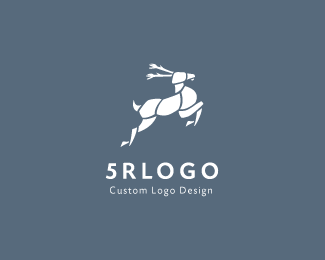
Description:
Custom Logo Design Service.
As seen on:
http://5rlogo.com
Status:
Client work
Viewed:
6284
Share:


Lets Discuss
sharp. love those, well done mate
ReplyLove deers, cool work!
ReplyThis is some good work here.
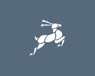
ReplyMakes me think of the butcher's chart detailing what area of the animal gets particular names for the cuts of meat... Interesting work, though. Why the 'portioning up' of the deer?
ReplyGood logo. Any reason you broke up the shapes the way you did?
ReplyNice piece of beef from the hindquarters :P
ReplyLove the style. Feel that the antlers look a little vegetabley.
ReplyThank you for all your comments
Replyrambal, curious about your thought process, can you share?
ReplyHi Raja,**Thanks. Soon I'll share the thought process.*
ReplyCool deer!
ReplyPlease login/signup to make a comment, registration is easy