take a nap
by rafaelaleite • Uploaded: Sep. 19 '09

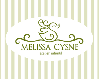
Float
(Floaters:
6 )
Description:
logo created for a company specialized in customized sleeping clothes and also all kinds of accessories for your bed and your entire sleeping experience.
Status:
Client work
Viewed:
2766
Share:
Lets Discuss
It's very cute...not sure if it skews too young/feminine. But cute still. Might want to reduce you word spacing on logotype and tagline by about 75%25.
Replyi'll try reducing the spacing, i think you're right. thanks!*and the young/feminine... well, that's their target. all the products are very young, joyful and fresh.
Replyupdated. word spacing reduced.
ReplyVery cute and girly without being too %22pink%22 or %22frilly%22. It's very fun. I love it.
ReplyPlease login/signup to make a comment, registration is easy