Float
(Floaters:
0 )
Description:
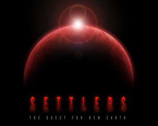
Logo design for Settlers, an interactibve educational application
Status:
Client work
Viewed:
1187
Share:

Lets Discuss
Can't believe I'm the first to comment on this one - and let me preface what I'm about to say with this: I'm not an internet troll and I'm not looking to rag on people's designs - I promise.**First off, this looks like a poster for a scifi horror movie. NOTHING about it says education to me. It might just be the planet shape and all the red. If you're looking to portray %22the search for new earth%22 perhaps the design should read as a little more hopeful? (try blues, greens, yellows - HAPPY colors...)**Secondly, the typography kinda sucks...you've tracked out the letters to the point where they're hard to read, and you've put a glow around %22Settlers%22 that's exactly the same color as the letters themselves (BIG design no no). **As I said, all this was said in the hopes of providing you with a critique and not a criticism. Take from it what you will!
ReplyCheers Jesse,%0D*%0D*The subject matter for this one is pretty dark. The destruction of the Earth and the quest to find New Earth. Not all the places the the user will explore will be jolly and happy. I believe more in making the users think and explore ideas in this educational setting so they can complete challenges.%0D*%0D*Thank you for the comment on the film feel though. The title design and intro animation was created to give that feel.
ReplyCheers Jesse,%0D*%0D*The subject matter for this one is pretty dark. The destruction of the Earth and the quest to find New Earth. Not all the places the the user will explore will be jolly and happy. I believe more in making the users think and explore ideas in this educational setting so they can complete challenges.%0D*%0D*Thank you for the comment on the film feel though. The title design and intro animation was created to give that feel.%0D*%0D*I also love big design no no's. Whatever you do someone will like or dont like. 'Rules' are there to be broken and let face it the people who make the 'rules' in the first place are only making an opinion on what has gone before.
ReplyAgreed - some rules are meant to be broken - but the design no nos I'm speaking of are there for a reason. Your design interferes with its own purpose because it is hard to read. **Your attitude about rules applies VERY well to the fine are realm, but with design, there is a purpose behind the visual elements, and if the design interferes with that purpose, then it's a poor design. **As far as the overall look goes, now that you've clarified what this is for, I think it's a much more appropriate feel. I would still ditch the PS lens flare though - cheesy cheesy cheesy. And tighten up the typography. Hope I'm not annoying you!
ReplyNAh you not annoying at all, The logo istself is really an identity and as such is part of a sequence. the elements never get smaller than 800x600 on the title screen and the world turns aas the flare rises. The glow is only on for about 6 seconds as the lettering appears and adds a nice effect to the letter forms.%0D*%0D*I do quite a few of these for multimedia apps apart from the 'traditional' logos and it is nice to do something different.
ReplySorry so long in between comments, but your last comment clarified everything for me. Nice work :)
ReplyPlease login/signup to make a comment, registration is easy