Float
(Floaters:
7 )
Description:
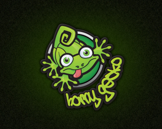
Horny Gecko logo design for Horny Gecko, the climbing and caving group
Status:
Nothing set
Viewed:
2465
Share:


Lets Discuss
i like your little horny gecko there, but the type is hard to read, maybe just adjust the kerning a little to give it some breathing room?
ReplyHi Gyui, will give it a go. They wanted the text quite squished but with the curve it may be a little too squished. Will have a play with the kerning and see what I come up with.
Replyi agree the text is a little too squished and hard to read. Maybe some custom type that follows the feel of the gecko hands would work better?**nice mark though.**I liked %22Horny Gecko logo design for Horny Gecko%22 %3B)
ReplyPlease login/signup to make a comment, registration is easy