Float
(Floaters:
8 )
Description:
An online forum for creative inspiration.
Status:
Nothing set
Viewed:
1770
Share:


Lets Discuss
Brilliant idea
ReplyNice creative spark.
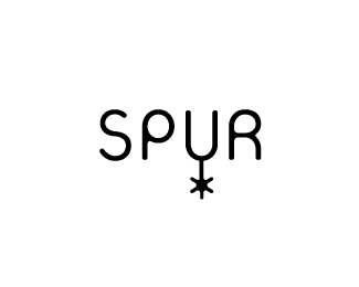
ReplyGreat work on the type. But I have to admit the concept reminds me of the San Antonio Spurs logo.
ReplyOh.
ReplySimple is good. Fantastic idea!!
Replyclever!
ReplyNice but I agree with ART. I saw SA Spurs off the bat.
ReplyI like the concept but not the font.
ReplyHmm, maybe I need to watch more sports.
Replyah man, was really liking the concept till someone pointed the SAS logo out...**Sorry lads its way to close to the bone...
ReplyYeah I immediately thought of San Antonio, guess there's not a whole lot of basketball fans around here, BUT I Love the style and execution on this. You did a nice job on that part.
ReplyI must admit. I immediately thought of Tim Duncan too... I mean San Antonio.**Too bad you can't move the spur as the %22u%22 naturally lends itself to that. Maybe a serif font would help get you away from the NBA look?
ReplyPlease login/signup to make a comment, registration is easy