Pr*tty Sh*tty
by prttyshtty • Uploaded: Oct. 15 '09

Float
(Floaters:
1 )
Description:
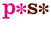
I replaced the vowels with asterisks, and then use those asterisks to label good and bad designs, which I compare and contrast every weekday.
As seen on:
Pr*tty Sh*tty
Status:
Client work
Viewed:
704
Share:
Lets Discuss
Interesting.
Reply*
ReplyVery nice especially considering what it is for. It is instantly legible and recognizable without overshadowing the work you post and compare. A wordmark was the perfect choice I think.
ReplyPlease login/signup to make a comment, registration is easy