
Float
(Floaters:
0 )
Description:
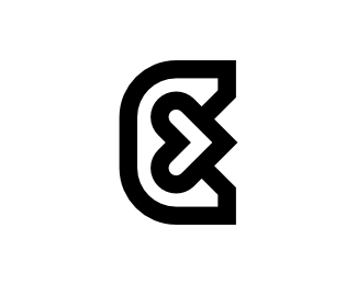
The letter K is formed from a thick outline with the direction of the arrow to the right, which can mean the improvement or progress of a brand or business. Modern, elegant, simple, unique, and great for any brand company.
As seen on:
B U Y H E R E
Status:
Just for fun
Viewed:
623
Tags:
monoline
•
K
•
INITIAL
•
LETTER
Share:

Lets Discuss
Please login/signup to make a comment, registration is easy