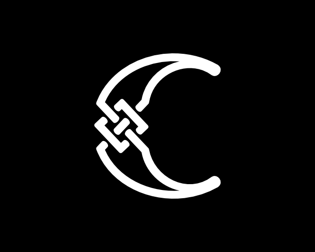
Letter SH Initial HS Logo
by proffartline • Uploaded: Sep. 25 '25

Float
(Floaters:
0 )
Description:
Letter SH Initial HS Logo. The brand shape is modern, simple and minimalist from a combination of the letters S and H with a mature concept. This logo is designed from a series of white lines that are very regular and have an accurate level of calculation so that it looks harmonious, perfect and does not go out of line. With a combination of curved shapes, the characteristic looks dynamic and flexible. The size of the trademark itself can be adjusted to suit media and platform needs without losing quality or sharpness.
As seen on:
B U Y H E R E
Status:
For sale
Viewed:
1,560
Tags:
HS
•
initial HS
•
SH
•
initial SH
Share:


Lets Discuss
Please login/signup to make a comment, registration is easy