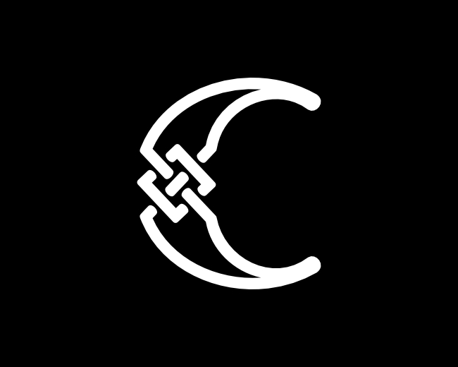
Letter HC CH Logo
by proffartline • Uploaded: Sep. 25 '25

Float
(Floaters:
0 )
Description:
Letter HC CH Logo. The brand shape is modern, simple and minimalist from a combination of the letters C and H with a mature concept. This logo is designed from a series of white lines that are very regular and have an accurate level of calculation so that it looks harmonious, perfect and does not go out of line. With a combination of curved shapes, the trademark looks dynamic and flexible.
As seen on:
B U Y H E R E
Status:
For sale
Viewed:
135
Tags:
HC
•
CH
•
letter HC
•
letter CH
Share:


Lets Discuss
Please login/signup to make a comment, registration is easy