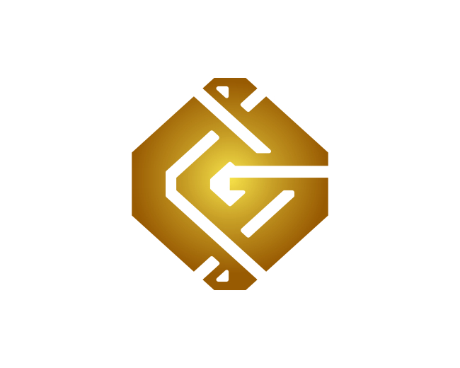
Letter G Geometric Logo
by proffartline • Uploaded: Jun. 18 '24 - Gallerized: Jun. '24

Float
(Floaters:
0 )
Description:
Initial G Geometric Logo. The logo design formed from the concept of the letter G looks simple, modern, futuristic and easy to read so that it can be understood when you see it. The logo is worked on seriously, focused, diligently and neatly. Trademarks have a high degree of flexibility and responsiveness in their application in various print and digital media. The brand is easy to remember in expressing identity clearly to be used as a symbol for companies, businesses, industries, communities and organizations.
As seen on:
B U Y H E R E
Status:
For sale
Viewed:
1,430
Tags:
Letter G Boldline
•
Letter G Blakcline
•
Letter G Geometric
•
Letter G
Share:

Lets Discuss
Please login/signup to make a comment, registration is easy