Description:
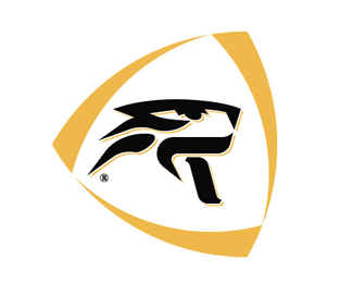
Design of a logo, labels and other materials for the Budweiser Budvar “Tygr” beer.
As seen on:
PositiveZero.co.uk
Status:
Nothing set
Viewed:
1547
Share:
Lets Discuss
i think the shadow is distracting the logo, maybe you have to find a better solution, but the mark is amazing*
ReplyI think the different otions of the mark against the type throws it off, it could do with the %22T: moving towards the right
ReplyPlease login/signup to make a comment, registration is easy