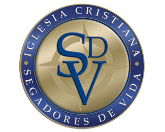
Description:
emblem of my church #2
As seen on:
Status:
Nothing set
Viewed:
2230
Share:





Lets Discuss
wow. this is really great. perfect work on the 3d look. may i ask in which program did you make this?
ReplyThis logo is stronger than your other version (the shield). But again, you may have printing issues with your type around the circle as it's pretty thin in spots. Your center type also blocks your central icon and you can't tell what it is. Love the color scheme though.
ReplyThanks for all the comments i'll keep in mind everything for the next and i did it in photoshop dotTOM
ReplyPlease login/signup to make a comment, registration is easy