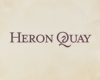
Heron Quay
by plantingSeeds • Uploaded: Mar. 23 '10 - Gallerized: Mar. '10

Float
(Floaters:
45 )
Description:
A finalised version of Heron Quay. A brand identity for the financial district of London.
There's two versions of the Heron, a detailed highlight version like on here and a near-silhouetted less-detailed one for use at smaller sizes.
Status:
Just for fun
Viewed:
9659
Share:
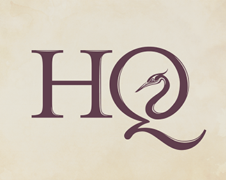
![Variant [v2]](/logos/12b18942b1d396b14be8ffa9dbebfe79.png)
Lets Discuss
I think you should make a small adjustment to the highlights in the Q. ie move them away from the edge. Otherwise nice.
ReplyNice design, highlights may not be necessary.
Replygood work, would be nice to see it in a smaller size, just to see if any detail get lost.
ReplyThanks for your feedback guys**@firebrand: I'll give those highlights a tweak and see. Cheers.**@Jerron: The highlights are only for the large Q and to flow it into the heron head. For smaller sizes, the bird and the lettering is flat detail.**@Alex: check out 'Heron Quay - single line' uploaded in my gallery which shows the heron as a silhouette for small sizes.
Replyi really like it. very good job!
ReplyAgree with the others regarding the highlights. Probably don't even need them.
ReplyThanks Andreiu :)**@Ocularink: I've updated the logo now without highlights on the 'Q'.
ReplyThe shape of the letter Q is amazing. Really nice logo.
ReplyThis really well done. Question if this is for 'A brand identity for the financial district of London.' why is it for sale on BS?
ReplyCheers LDM.**@Mike: Heron Quay is an area of the financial district in and around Canary Wharf in London. And I love both the name and the scenic waterfront. So I decided to use it as a brand identity project 'just for fun'. I was pleased enough with the outcome that I felt it would be a shame if it didn't get used in some capacity. **So I have it up for sale on Brandstack. (although unfortunately I don't think it will sell, unless the customer wants to edit the name to suit their business)
Replycool mark.....
ReplyBeautiful typography. I love the shape of the Q!
Replyi jus luv this, nice work :)
Replyfantastic Q, really well executed. Great job Plantingseeds.
ReplyThanks guys and girls! *I'm glad ye like the typography and the Q in particular. :)
ReplyNice logo, like what you've done with the Q!
ReplyPlease login/signup to make a comment, registration is easy