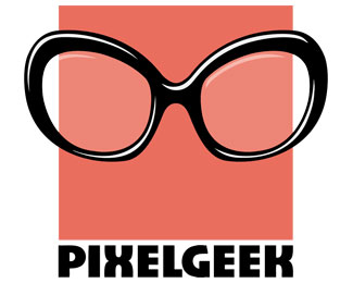
Description:
I am working on a logo for myself and am just kind of stuck--I am not loving the font or the color... any suggestions would be greatly appreciated!
Font Change 12/4/2011
Status:
Work in progress
Viewed:
641
Share:
Lets Discuss
I like this, it's got the elements of something really cool. Try more simple. A font with square edges, the glasses made of pixels.*Perhaps the Text integrated in the pixel square, or at least the same colour. Also the glasses more square too. Try looking at e-boy for inspiration? Look forward to seeing developments.
ReplyThank you so much for the feedback. I am going to try out some of your suggestions!**I am a little scared, though, that making everything squarish might have a stronger masculine feel, and while I do not want the logo to be super girly.. I would like it to have a little bit of a feminine touch.
Replyi agree this has a potential. experiment with the font type, scaling, position, and color. i like the glases with the pixel :)
ReplyThank you T-Sovo! I am glad you were able to tell it was suppose to be a pixel..! I am looking through 1000s of fonts to see if I can find some better suited ones.**Is there anything y'all think I need to do to make it more easily identifiable as a pixel? I wanted to leave it flat (i.e. no gradients, highlights, etc.) since pixels are 2D, but I think I may be losing some uniqueness because I am not conveying the pixel concept effectively.
Replysize down the whole logo and u could try to add 8 more pixels around the ONE but only inpartial maybe by fading gradients or lines :)
ReplyThis reminds me of the Drawing Book logo. Have you seen it? http://drawingbook.com.au/
ReplyNo, Jen, I had not seen that before! What a fun site!
ReplyPlease login/signup to make a comment, registration is easy