the golf space
by pixelbatch • Uploaded: Jul. 06 '10

Float
(Floaters:
2 )
Description:
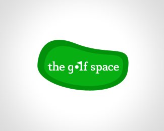
I tried to incorporate both "golf" and "space" into this logo. I created a green to represent the word golf, and used the space around the golf ball (by bounding it off with the ball and the side of the letters "g" and "l" to create a green "o") to represent, well, the word space. Looking for some constructive criticism!
Status:
Student work
Viewed:
1657
Share:


Lets Discuss
Perhaps you could use a hole instead of a ball because it's more like a 'space' to be filled? And maybe the 'the' could be smaller so 'golf space' stands out more? Just a thought, I like the idea. :)
Reply@mattjamestaylor thanks! I'll try the idea out
Replyi might suggest using the ball as 'o' and the flag as an 'l' or 'f'
Reply@yelds thanks for your suggestion. at first I thought that it may be overkill, but making the %22l%22 a flag actually made the logo look better and helped border the %22o%22 even more effectively. all comments are extremely valuable especially since I just started my journey with logo design :)
Replyoh and this is my edit*http://logopond.com/gallery/detail/109254
ReplyPlease login/signup to make a comment, registration is easy