Float
(Floaters:
21 )
Description:
Concept developed for an investment bank dealing in international markets
Status:
Nothing set
Viewed:
7534
Share:


Lets Discuss
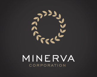
Is this concept of an olive branch/wreath?
ReplyI like how it spins around, great movement.
ReplyThis has a unique type treatment, great color scheme, lovely balance and harmony and a beautiful mark with a concept. Nice job!
ReplyVery nice. Would love to move the mark down a touch though.
Replybartodell : Love your work mate. The concept is meant to be a wreath/olive branch etc.**hellouriah, OcularInk : Thank you so much. It's very rewarding to hear such positive comments from awesome designers. Love your work respectively.**spyrte : Thanks mate. Unfortunately the client went with the plain Minerva Corporation identity (Typogram on blue background)**mr2creative : Thanks mate. Will move it down for our portfolio. Thanks for your advice.
ReplyVery nice. The inner leaves being smaller is what makes this work. Good execution.
Reply%22The inner leaves being smaller is what makes this work.%22**plus 1
Replygreat mark , but imo need some work on typo**@respiro: I've never understood your way of thinking - votin down a logo without any comment. It's your right , sure , but whenever I see an extremely good logo it's only you who sink it. Of course - without any note. I mean overall , personally I don't care about votes. I think constructive critique is what every designer really needs
Replyi think he presses the wrong button judging by his comment ... great logo btw - great thought... and execution
Replygthobbs , Respiro, kaimere, nima.jazireh : Much appreciated guys. It makes me happy to know I wasn't an idiot when the client opted for the simpler typogram. Love all your showcases.. Please keep adding to them so we can all be inspired!
ReplyKwaku : Thanks mate. I agree with you 100%25. Love your work.
ReplyGreat flow... Love this logo...
ReplyPS just an idea - what if you put MINERVA inside the wreath?
Reply@ Type08 : Thanks for your comments. I think the balance will be lost if the two elements were mixed. Regardless, the client opted for a much simpler, much more basic identity. Oh well :o)
ReplyPlease login/signup to make a comment, registration is easy