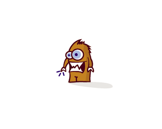
Description:
Logo for a site that will sell everything, since they will sell everything from a plush toy to a hardware they wanted me to do something fun, then i came up with the idea of a character which is a monster, i still have to name him... any suggestion will help :). I still feel like something is missing, what do you think it might be? What tweak should i make?
Status:
Client work
Viewed:
3885
Share:

Lets Discuss
That lil nub at bottom right looks like a foot. This makes his entire lower body look like it's on backwards. That square mouth looks like a stock market chart gone mad. Actually an apt innuendo for this project. His whole body stance is not dynamic. A frenzied shopper's body language would be more contorted. Why are the hands crab claws? The hair-lick on top seems matted together. Frenzied shopper's might have a little wilder hair. Overall it seems like you've restrained the character to make excessive shopping seem somehow sensible and under control. In reality most shopping (likely this client's intent) is a manipulated message to invoke an outmoded primitive response. See the Frontline documentary online called %22The Persuaders%22.
ReplyThanks a bunch michael, i agree with 80%25 of what you said, but about the hair since he is shopping through the internet his hair won't get wilder since he won't even leave home, about the his body language this is a monster so it really doesnt have to have a well shapped body. Anyway i'll try some modifications, this project still at it's beginnig i still have a long way ahead.
ReplyJust made some modifications
ReplyPlease login/signup to make a comment, registration is easy