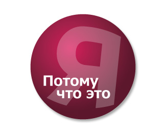
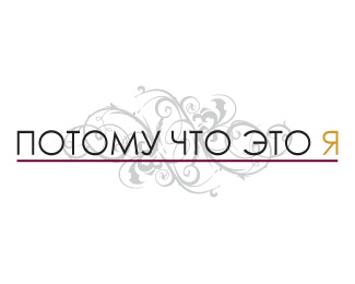
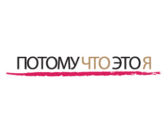
Potomuchtoetoya Logo
by pearsestreet • Uploaded: Apr. 08 '09

Float
(Floaters:
0 )
Description:
This version of the logo implemented a circular design to offset the simple square design of their current logo. the rounded edges seemed sexier for a cosmetic company. A lighter "pink" was blended into their current crimson color and the reverse "R" was designed to emphasize the "me" in the name.
As seen on:
Potomuchtoetoya.ru
Status:
Nothing set
Viewed:
877
Share:


Lets Discuss
Please login/signup to make a comment, registration is easy