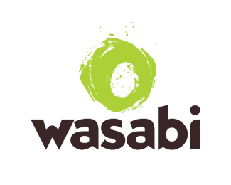
Wasabi
by paxilixap • Uploaded: Dec. 22 '08

Float
(Floaters:
11 )
Description:
Logotype proposal for "fast food" type sushi place. (nonpaying client, F them, the food sucks). Unused proposal.
Status:
Nothing set
Viewed:
9233
Share:
Lets Discuss
I definitely prefer this design to the other one posted. Too bad about them not paying, but did you at least get a deposit?
Replyyeah. this one was my only proposal but they changed their minds and wanted a %22real%22 type. No deposit, i lost a friend. Had been working with him for years in various ventures and he finally stiffed me. now i ask my mother for a deposit. always. i found a few books of legal forms for designer (on for US in PDF and a physical one for Mexico). I was seeing a video on YouTube which stated %22never bring sh*t%22, that is what your client will choose. At least on the other one i choose a nice type, at least it didn't end up with Helvetica.
ReplyLove it. They made a big mistake.
Replythx logoboom. you got great work!
ReplyThanks pax.
Replypaxilixap, really nice logo, i would have liked to see what they went with. I think this is too good for fast food sushi!:)
ReplyI agree with everyone too, I really like this logo. I feel you one the non paying client stuff... I did a paid internship for school a few years ago, never got paid a penny, but had to stick it out to get my credits... missed out on months of making money since I spent all my time there... Talk about a rock and hard place... people can suck!
Replygyui: the one they used is also posted. the mark is the same but for type i used a kerned Blindfish from FontHaus (not sure who the original designer/foundry is). They wanted a sans font to go with this 2.0 crap, at least i could get an edgy sans in there, but this one was what i was going for.**grabbdesigns: i know how you feel and it is a bit worst here in mexico. they trademarked the logo. for what i have read my rights as author of this work is still mine. I would have had to given up those rights in writing as the only way to transfer them. if this wasn't Mexico I could get my money. **Thanks to all for the comments. The %22Cebalia%22 mark is a work still in progress, just go the deposit 2 days ago, I would LOVE comments on those. Specially the one that is a bit diamond shaped.
Replyedit. Both of Cebalia could be seen as diamond shape. I am referring to the one with the mark on the left. Tnx.
Replylove the logo. on a professional note, not really a good idea to say %22F them%22 when referring to a former (non-paying) client. It isn't very professional and could make you look bad. Love your work man, keep it up.
Replyi was a bit mad, still am, Arronlock. but i understand. maybe i won't turn the other cheek but start working with a bit of legal view instead of just creativity.**thanks all for your comments. %3B)
Replyamo este logo, %BFtu dise%F1aste la tipograf%EDa? me emocion%F3 demasiado, l%E1stima por las perras que no pagaron, es mi peor miedo, los malos entendidos y los gorrones. Pero bueno, por mi parte me re%ED mucho con tu descripci%F3n, y te apoyo, F them! those greedy bitches.
ReplyI think this is a great design! What font did you use? I've been looking all over the place for a brush script font like that... Keep up the good work!
ReplyHi,
ReplyI'm interested in purchasing this logo. Could you please get back to me if you want to sell it.
I'm interested in purchasing this logo for use in a sushi restaurant can you contact me please at informed99 (at) gmail.com
ReplyPlease login/signup to make a comment, registration is easy