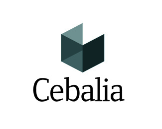
Cebalia
by paxilixap • Uploaded: Dec. 22 '08

Float
(Floaters:
4 )
Description:
First drafts of brainstorming for the corporate mark for a company that owns construction and steel trading businesses. They are looking for an identity for the parent company of these businesses.
Status:
Nothing set
Viewed:
2993
Share:

Lets Discuss
I feel like the mark might agree better with another font, but I do like the font you chose a lot on its own.**My issue may really just be with placement, though. When the name is kerned so tightly, it feels like the mark is just kind of sitting on its own there to the side. Regardless, I much prefer this concept to the other posted, and it's a great mark.
Replythanx quson. i did get that here regarding the type (with another mark). i did kern too tight, i just fell in love with that typeface that day. i am still working on this logo. typeface will change for sure and i am still working on other marks.**:)
ReplyPlease login/signup to make a comment, registration is easy