Description:
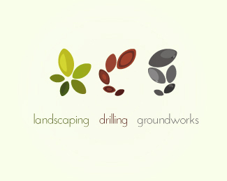
work in progress for OCG logo. The idea for this logo was to use one simple shape to show each service the company provides.
OCG is a landscaping, drilling and groundworks company. The symbols are abstract versions of the letters O, C and G.
The O is a shrub depicting landscaping. The C is drilling and shows rings of earth drilled down into on select oval shapes. The G is groundworks and is stone and pebbles forming the letter G.
Larger version here http://www.flickr.com/photos/74657383@N03/6781047712/in/photostream
Status:
Work in progress
Viewed:
4990
Share:

Lets Discuss
Beautiful and good concept. Words can be closer to each other.
Replybeautiful work !!
ReplyPlease login/signup to make a comment, registration is easy