Description:
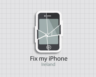
Work in progress for fix my iPhone. Given a graph paper background and a drop shadow to add a bit more "pop" to the logo.
Status:
Work in progress
Viewed:
4680
Share:



Lets Discuss
I like the idea of this, there's a nice emotional impact here. Have you thought about making a more simplified two-tone version? Like simplify the iPhone to being just silhouette with %22cut-outs%22 for the screen and button with a basic looking crack or two going through the screen area. Just thinking about the scaleability of the logo. It looks nice here but my concern would be if it needed to be shrunk down much smaller, it seems the details could potentially detract from keeping the image recognizable.
ReplyGreat! i agree with viiia...simplier Nicer for all porposes
ReplyPlease login/signup to make a comment, registration is easy