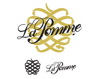
Description:
Designed at 1 Trick Pony in sunny South Jersey
As seen on:
Status:
Client work
Viewed:
1960
Share:

Lets Discuss
Really digging the mark! Would probaby benefit from a less cluttered presentation though...
ReplyThe problem here is the background is bolder than the foreground. Lighten/thin the background out. Keep the head of the snake bolder then thin towards tail. Two reasons, what I've already stated about the background overwelming the foreground, and, it being a snake forming an apple is not readily apparent I do not think. I'm thinking now you should bold up the font a bit and position it below your filigreed, snake apple.
ReplyPlease login/signup to make a comment, registration is easy