Float
(Floaters:
18 )
Description:
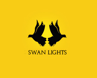
fancy light logo used negative space for this :)
Status:
Work in progress
Viewed:
2709
Share:



Lets Discuss
They don't look like swans at all. Maybe pigeons or something.
Reply%5E lol
Replywil change it soon
ReplyDefinitely don't see swans. This looks a little forced to me.
ReplyI don't see lights or swans. Looks like an ink stain.
ReplySwans have long necks. Nice idea though..... if they were swans.
Replythank you for the comments:)
ReplyYeah more like Dove Lamps, but no swans, but agree with James Ewin its still a good idea
Replyis this a Rorschach test
Reply%5E lol
ReplyGreat !
Replythak you guys:)
ReplyGreat concept! Would love to see the execution refined.
ReplyNicely played with the negative space...with minor adjustments I think you can make everyone happy 'bout the swan thing...I agree on that, they don't seem to be swans...but you'll fix it in no time.
ReplyGreat idea! One of the best from you imo.
ReplyPlease login/signup to make a comment, registration is easy