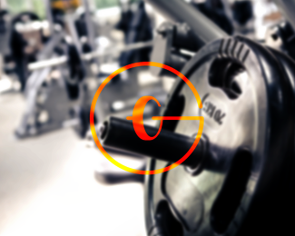
Getfit Gym
by ozean1605 • Uploaded: Nov. 06 '14 - Gallerized: Jan. '17


Float
(Floaters:
22 )
Description:
Getfit Gym Center
Services:
Gym - Fitness - Yoga
As seen on:
cargocollective.com/okey
Status:
Client work
Viewed:
9847
Tags:
branding
•
logo
•
haibui
•
ocean1605
Share:


Lets Discuss
This ir really Good!
ReplyThis is a great idea, but I feel like it could be executed a bit better. For one, I think I would get rid of the outer G, as I think it's detracting a bit from the smaller, more conceptual G. I think just having one G is fine, especially if it will allow you to increase the size and readability of weight.
ReplySmart! I disagree with Sam; I think the external G helps frame the logo nicely. Also, without it, you'd be left with one plate and half a bar - which would look very odd. The enclosing G allows you to get away with this.
ReplyThe only thing I'm not sold on are the extra little strokes on the G's in the type. They feel a bit extraneous to me.
Thank you @samdemastrie and @atomicvibe for comments!
ReplyDefinitely a good idea, but I agree with Sam and atomicvibe! (On my opinion now prefer it's a car wheel.) But it's a really great idea! ;-)
ReplyLogo for sale?
Reply@lopejt74 Yes!
ReplyThanks for watching!
Please login/signup to make a comment, registration is easy