Float
(Floaters:
1 )
Description:
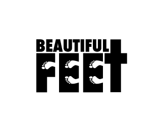
Created for a local church
Status:
Nothing set
Viewed:
1679
Share:


Lets Discuss
Sorry to say, but I don't get %22beautiful%22 at all from this.**Feet are elegant in my opinion (not to be weird) and this doesn't show that to me.**Maybe focus more on the curviness of the foot?? Script font for the word beautiful?
ReplyEXACTLY!!! I did exactly what you said amongst other things, and was told they wanted more %22boldness%22 and less elegance?!?! I do agree that feet ARE elegant, but they (the church) wanted me to focus more on bold type and a cross?!?! Any one of my brainstorming thumbnails is better than this... BUT this is what they wanted. Gave me no creative freedom... BUT it was a nice paycheck!!! HA
ReplyOh yeah... and they wanted it as simple as can be!!!
ReplyI've had clients like that before. Really sucks :(**Atleast the check was good :)
ReplyPlease login/signup to make a comment, registration is easy