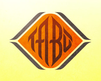
Tabu
by stonedburo • Uploaded: Mar. 28 '11
Description:
The basic idea is to resemble the oriental style in the logo, based in some islamic calligraphy samples.
Status:
Unused proposal
Viewed:
1659
Tags:
calligraphy
•
ariental style
•
taboo
Share:


Lets Discuss
Looks really good, but I would remove the top part of the 'U' and extend those pieces up.
Reply%5E Agreed. Makes it look like TABO, It's a good piece all the same. :)
Reply%5E%5EWhat Joe and Josh said.
ReplyAbout the top part of the U is the accent %B4, which is ised in spanish language, so that is why I decided to use it like that, thanks.
Reply%5EOh, well the description title is misleading. Looks good in that case.
ReplyNice type.
ReplyPlease login/signup to make a comment, registration is easy