by opwancanopie • Uploaded: Mar. 04 '10
Add to Pad (In 1 Pad )
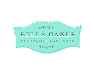
Description: Final version Status: Client work Viewed: 1691 Share:
This has a nice feel to it. Maybe Bella Cakes should fill up more space inside though.
Made the 'Bella Cakes' type a bit bigger. Thanks for the suggestion, JP.
Beauty. Now I'd also make the word spacing a bit tighter.
Where is bella cakes located?
Niagara Falls, Ontario - It's still in the process of being set-up by the owner
I tightened it up just a bit. Thanks for the suggestion, LB.
I would differentiate the two l's a bit. There's still quite a bit of space between the two words. I do enjoy the style though. Looks like a fun client.
yeah I was speaking about the loose word spacing...not the kerning
however the %22ke%22 kerning pair might need to touch to tighten
I was speaking about the word spacing, not the kerning. However the %22ke%22 kerning pair might need to touch to tighten
(sorry for the multi post)
Oye est%E1 muy chulo! (Looks pretty cool)
Please login/signup to make a comment, registration is easy
Follow
")


Lets Discuss
This has a nice feel to it. Maybe Bella Cakes should fill up more space inside though.
ReplyMade the 'Bella Cakes' type a bit bigger. Thanks for the suggestion, JP.
ReplyBeauty. Now I'd also make the word spacing a bit tighter.
ReplyWhere is bella cakes located?
ReplyNiagara Falls, Ontario - It's still in the process of being set-up by the owner
ReplyI tightened it up just a bit. Thanks for the suggestion, LB.
ReplyI would differentiate the two l's a bit. There's still quite a bit of space between the two words. I do enjoy the style though. Looks like a fun client.
Replyyeah I was speaking about the loose word spacing...not the kerning
Replyhowever the %22ke%22 kerning pair might need to touch to tighten
ReplyI was speaking about the word spacing, not the kerning. However the %22ke%22 kerning pair might need to touch to tighten
Reply(sorry for the multi post)
ReplyOye est%E1 muy chulo! (Looks pretty cool)
ReplyPlease login/signup to make a comment, registration is easy