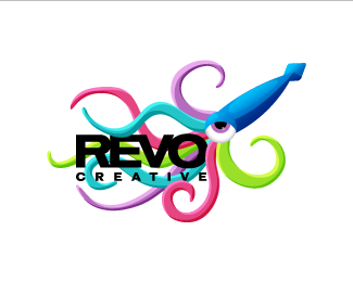
Stunning. Love the grace present in this logo. Plus, it communicates the company's name exceptionally well, and the type doesn't get 'lost' with smaller sizes%3B it's all perfectly balanced. Very, very nice. Great work. Wouldn't be surprised if I saw this in the gallery sometime soon.


Lets Discuss
thanx.
Replyyes, nice.
Replycool :D
ReplyVery nice mark!
ReplyStunning. Love the grace present in this logo. Plus, it communicates the company's name exceptionally well, and the type doesn't get 'lost' with smaller sizes%3B it's all perfectly balanced. Very, very nice. Great work. Wouldn't be surprised if I saw this in the gallery sometime soon.
Replythanx guys!
ReplyI love it! Very nice. I did some waves recently as well :)
ReplyPlease login/signup to make a comment, registration is easy