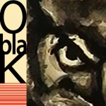
sowlo
by oblak_ID • Uploaded: Oct. 02 '09

Float
(Floaters:
8 )
Description:
(swag akademy to sowlo)
Status:
Work in progress
Viewed:
2559
Tags:
soul
•
owl
Share:


Lets Discuss
I'm not entirely sure what's going on here. The icon looks a little like a deformed owl, and I'm not a big fan of the type at all. The 'S' looks out of place, and the editing on the 'A' seems unnecessary. Of course, this is just IMO
Reply@ Chad I agree with you about the font, thanks ( I'll change it ). On the other hand I have done many drawings, paintings, mosaics of owls so icon stays for now ( every %22deformation %22 was made intentionaly).**@ tonfue You can see whatever you want ( rorschach, id ). Enjoy**Thanks for comments
ReplyLol. I respect your opinion. You have made some nice logos. One of my favorite is the teleporting turtle %3B)
Reply*you have such a mass of well done logos, many of them with only a few or none floats ...*can't believe that ... I think you have great skills !!
ReplyPlease login/signup to make a comment, registration is easy