Description:
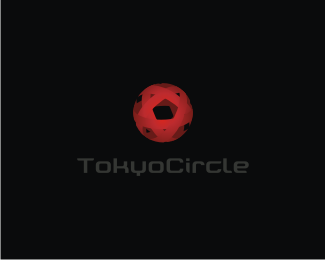
A social networking website for English speakers living in Tokyo. The shape is based on the 'Sun' as well as an origami ball. WIP
Status:
Nothing set
Viewed:
4073
Share:

Lets Discuss
Nido... reminded me a tad of %22Total%22:http://www.identityworks.com/reviews/2003/total.htm and %22Assurant%22:http://www.identityworks.com/reviews/2004/assurant.htm which is probably because of the %22Wicker Ball%22:http://www.logolounge.com/article_images/artpics/art_2005_wicker.jpg trend from a couple years ago.
ReplyNo prob Bart.. i had thought Total when i first got the idea... so im not surprised there... i did however also think it may be enough though to be different too.
ReplyI think it is different. However you know how others will see it. I love the other one man. Nice work. Way to step up your style.
ReplyI feel the same as Bart. The logo looks great, but to me, this concept is just sub-par to what you can really do. The other one is stronger indeed. However, on the other one, I see Target. Even though the 'target' shape is open for use, I feel Target has branded it too well to work as a concept in my opinion. This seems like a tough project, but I know you can pull it off.
ReplyPlease login/signup to make a comment, registration is easy