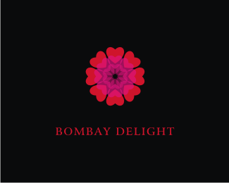
Description:
Indian restaurant...
As seen on:
Status:
Nothing set
Viewed:
8288
Share:
Lets Discuss
I love the shape, got something of a kaleidoscope. In contrast to that the type seems a little general. *Anyway I really like this.
ReplyI'm not a ig fan of the red and pink, maybe a darker red and brown instead of pink ?*I don't mind the font that much, but what is the logo for ?
ReplyNice. Seb it's for an Indian Restaurant!
Replyi know you have some nice logo work in ur portfolio, but , regarding this, just IMO:*I don't feel comfortable with the proportion of symbol and logotype, for any restaurant their selling point is their name. The size of logotype needs to be increased. %3B)
ReplyDespite what others say. I like that symbol alot. I think the type needs alot of work. But. Dont scrap it. there is something to that pattern. You can use it elsewhere. its very very in.
Replyvivid...India. yup
ReplyHi Nido, like this logo of yours and as I'm running a series of designs centred on heart shape, would like to know if you're interested in having me write a post on this logo? *It will be a link back to your site and if you like, include the tools you used to create the logo and the inspiration behind it.*Do check out my site cluelessclay.com and let me know if you like to have me write a post and a short interview with you on this logo, cheers!
Replythank you mei.. %26 sure.. sounds great... you can contact me on thisisnido@gmail.com
Replygreat work again, nido. Added to my faves straight away.
ReplyPlease login/signup to make a comment, registration is easy