Description:
claims solicitors
As seen on:
icarus
Status:
Nothing set
Viewed:
14596
Share:


Lets Discuss
i love the icon!
ReplyIcarus is a character in greek mythology.
ReplyLooks like they'll bend over backwards to get those claims! Good job dude.
Replythanks fellas.. heheh.. hey chan, they bent over backwards to have all the design work done.. but i dont think anything ever came of this..
ReplyVery neat mark indeed.
Replylove it
ReplyI love the unrest pose of the winged guy.
ReplyBeautiful icon man :) great job.
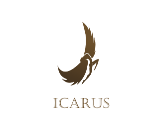
ReplyNido, I love the mark, but for the life of me, all I can make out is a pair of wings. Am I supposed to be able to see a person or something else?
ReplyAgree with Sawaan. This seems to his moment between flying and falling. Wonderfully done.
ReplyThanks guys...**@koodoz: thanks mate, yeah in between the wings is the upper part of the body arched backwards. take it you can make the legs out yeah?
ReplyWOW! I forgot about this one. Nice work Nido!
ReplyThis is nice, nido. Very expressive. However, when I look closely at the part of the body from the waist up, it seems kind of off. Not sure why though. Even so, I'm just being nit-picky cause you are so freaking talented.
ReplyAmazing, very very good icon!
Reply@nido: I think I've gone cross-eyed, but I've finally managed to see the figure. Even after you described the arching back and feet, I really struggled to see what I was looking for. I think the main problem for me seeing the figure was that I was expecting the person to be proportionate to the wings as they are massive in comparison. I was also looking at the negative space and couldn't see a thing. This may be an issue that needs to be looked at...
ReplyIt's so dynamic! awesome
ReplyI like the concept, however the negative space between the wing and the figures backside bothers me. it like jumps out almost as if there is hidden shape to be found, but after examining it for a while you realize there's nothing there, then it just sticks out as the predominant focus.
Replynido, your mark totally inspired one of mine along the same vein. Cheers*%22link text%22:http://logopond.com/gallery/detail/25624
ReplyVery cool! There doesn't seem to be very good continuation because my eye doesn't head into the type unless force. A bit uncentered, but, I really like it!
ReplyGreat Logo, Great work!
ReplyWhen I saw this in a glimpse, the negative space between the right wing and leg looked like another leg and the figure looked like being kicked. I don't mean any disrespect by this comment :) Oh, and I personally prefer if the type was solid. Anyway, I like how the logo emits emotion, I feel Icarus's struggle.
Replynice icon
Replydon't know how i missed this one
ReplyBeautiful icon man! great job.
Replyhttp://www.youtube.com/watch?v=b8qDz7K1nbU - Yeah!
ReplyPlease login/signup to make a comment, registration is easy