Description:
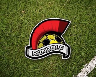
Logo for a personal soccer team
Status:
Client work
Viewed:
1205
Tags:
•
sports
•
Soccer
•
Randolf
Share:


Lets Discuss
I like your idea here, but I'm not sure all the elements work together. The ball looks like it should be further to the right otherwise the crest is just just floating over it rather than the two being connected.
ReplyCould you simplify it a bit, take away some of the shadows or the effect on the ball? Using fewer colours would probably help it a lot
Hope that's helpful, IP.
Please login/signup to make a comment, registration is easy