by nickosma • Uploaded: Dec. 05 '08 - Gallerized: Dec. '08
Add to Pad (In 48 Pad s )
Description: Interactive Agency Status: Just for fun Viewed: 8643 Share:
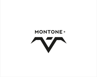
Nice arrrow effect and great type. %3B)
thank you robertocorobori
i think its because of the lines on the arrows (illusion), some kind of intrigue %3B)
I think at the very least the baseline of the arrow head should be parallel to the type.
I can see what clash is talking about. It looks like the arrow is rotated instead of skewed to match the angle/lean of the type. Nice colours.
yes, the arrow is parallel to the font axis (which is skewed in this case), thx for all comments. regards
energetic
Agreed, work with the angle a little, the arrow could be straight or matching the type angle maybe?
Both, the type and the arrow reflect the esence, which is power, energy.
Love the type
thanks Jc :)
Please login/signup to make a comment, registration is easy
Follow


Lets Discuss
Nice arrrow effect and great type. %3B)
Replythank you robertocorobori
Replyi think its because of the lines on the arrows (illusion), some kind of intrigue %3B)
ReplyI think at the very least the baseline of the arrow head should be parallel to the type.
ReplyI can see what clash is talking about. It looks like the arrow is rotated instead of skewed to match the angle/lean of the type. Nice colours.
Replyyes, the arrow is parallel to the font axis (which is skewed in this case), thx for all comments. regards
Replyenergetic
ReplyAgreed, work with the angle a little, the arrow could be straight or matching the type angle maybe?
ReplyBoth, the type and the arrow reflect the esence, which is power, energy.
ReplyLove the type
Replythanks Jc :)
ReplyPlease login/signup to make a comment, registration is easy