Description:
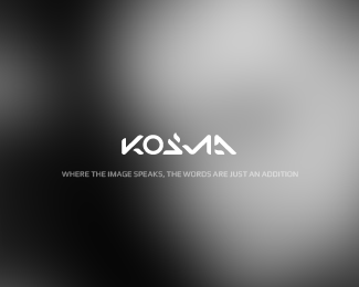
First project of the logo for small, flexible agency which specialize in grants of the European Union. The case was not to relate the project with common EU signs.
Status:
Client work
Viewed:
12193
Share:


Lets Discuss
very nice work
Replythx janzabransky
ReplyVery attractive mark, I like the depth and dimension.*The only thing I'd like to point out is, the kerning on the typeface might need a little work.*Overall, it's a pretty cool logo though.**-Kode
Replythank you Kode, i'll take a look
ReplyThe mark does a nice job of evoking the 'flexible' aspect of the company.
Replyguess by now you kinda get the feeling that most of us like this..
Replythx OcularInk %26 nido
ReplyLove the shape of the mark. Congrats.
Reply%5E I concur and like the color also.
Replyfirebrand %26 logomotive - thanks a lot, I appreciate it
ReplyGreat conceptualization of the %22flexibility%22 !
Replythx epsilon, regards
Replyexcellent work, but the font..
Replythx tanyildiz.
Replynice one
Replythx logotivity, regards
ReplyExcellent!
Replythank you very much mabu
Replyjus so flexible..
Replythanks for your comment dbunk, regards
ReplyReally nice looking Nick.
Replythank you very much Joe.
ReplyPlease login/signup to make a comment, registration is easy