Description:
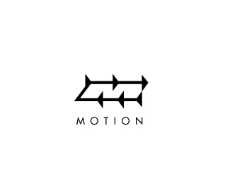
Directional arrows representing motion also form the letter 'M' with negative space.
Status:
Unused proposal
Viewed:
16489
Share:





Lets Discuss
Awesome style and great concept!
ReplyThanks, adolfodavid!
ReplyNice work! Like this.
Replycooool one
ReplyThank you, JF and Bernd!
Replywow this is amazing!
ReplyThanks, Eric!
ReplyI always loved this one!
ReplyThanks, Oski!
Replyi was wondering why put so many arrows... looking at it harder, i saw a great revelation. lol gj
ReplyI think if you got rid of the arrow at the bottom right corner it would be more balanced and make more sense. You'd end up with a nice right-angle for the M and you wouldn't have two arrows touching each other, which doesn't happen anywhere else. It would also match the left side of the mark. Regardless, great work.
ReplyFinally where it should be! Congrats Nick!
ReplyI agree with Sam, but like it as it is as well. If you try it, when you lose that corner arrow Sam is talking about, I would suggest then pulling the horizontal line to the right and lining it up with the vertical stroke of that top, right arrow so it defines the right side of the negative M.
ReplyThanks Kotan, Sam, Oski, and Sean! Great suggestions. I'll work with it and see if i can improve on it.
ReplyVery nice work!
Replyomg! Kudooooos! Favourites..
Replyooh nice
ReplyWOW That is vision!!! Brilliant use of negative space!!!
ReplyGenius!!!
ReplyGreat job Nick.
ReplyI've seen this one several times, and I've always meant to float it and comment on it, so here goes: I. LOVE. THIS. It's so deceptively simple, yet totally works the positive/negative space play in a very strong way. Consistently great work, Nick!
ReplyThanks LifeStart, jurcek, cerise, logomania, antonio, matjak, and atomic!
ReplyThanks
ReplyLove this one! Awesome use of negative space.
Replythanks, limeshot
Replyunused proposal ... can not believe my eyes ...***Just couldnt be better man ! Well done !
ReplyCool dynamic idea!
ReplyThanks Jands and Artgeko!
Replydamn... still come back to see it again... :)
ReplyPlease login/signup to make a comment, registration is easy