Description:
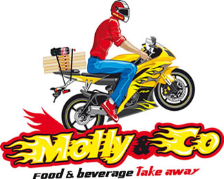
logo illustration for pizza take away
As seen on:
weblogo.it
Status:
Client work
Viewed:
1145
Share:






Lets Discuss
Although it's a well drawn illustration the amount of minute detail in the motorcycle and rider makes for a bad logo. You have to take some time to study it in order to figure out exactly what's going on. It'll probably be fine on the side of a car or truck but in smaller applications it'll be hard to decipher. Good luck.
ReplyHi sdijock, I think also in a smaller application like the pizza'case is good because the details are not shadows or special effects made in photoshop, but are illustrations made in illustrator, so the details are clean! Otherwise what illustration would be without details...
ReplyI wasn't talking about pixel vs. vector graphics, just the amount of detail in general. It's a fact that illustrations with a lot of small detail will get lost at smaller sizes. Even at your preview size on this site it's difficult to tell that those are pizza boxes and a bottle of soda. Thus the reason why you don't see a lot of these types of highly detailed illustrations for logo applications.
ReplyPlease login/signup to make a comment, registration is easy