GR001
by nessarobbins • Uploaded: Jul. 09 '12

Float
(Floaters:
0 )
Description:
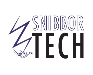
The Snibbor Tech company is where they go into computer software and strike the bugs in the software to get rid of them. So this logo shows a form of a lightning bolt because lightning strikes. The font of Snibbor Tech is Futura Condensed Medium.
Status:
Student work
Viewed:
1372
Tags:
In Company of Logos
Share:


Lets Discuss
i love it! but i think id make the stroke on Sniber a little thicker like just one or two strokes up. I love love love how you have the TECH big and how it stands out and i like the font you chose!
Replygenesse, i'm struggling with digging on the lighting bolt, i don't see it being needed. i really enjoy the outline of snibbor and the size, in comperrison to the tech. i like the contrast and the a symetrcal balance. i'm really thinking that if you lose the bolt i would like it, maybe if you add a reflection to tech, that might add jsut enough pop to it. cheers.
ReplyIf this is a computer software business, I think a better idea may be to take the lightning bolt out, place a generic computer monitor and tower in there, and place the lightning bolt into the computer screen. heck, make the lightning bolt look like an S and place it in there. The color scheme is great, but it seems a bit dark.
ReplyI wouldn't suggest putting a "generic" anything into a logo. =P
ReplyI wouldn't suggest putting any electronic equipment whatsoever unless the client wants their logo to appear outdated in a couple years.
ReplyI agree with not putting anything generic. The client even wants to add a bug at the bottom of the lighting bolt. What does everyone think.
Replynessarobbins,
ReplyI agree 100% with tabithakristen and jerron (of whom are both respectable designers and logopnd users). I don't feel this logo is strong at all. It feels very generic and not very thought out. I don't know about the bug concept I would have to see some drawings in order to get the feel of what the client/you are thinking of. Sorry I can't offer more at this time, but I feel that you could rework this.
Please login/signup to make a comment, registration is easy