Description:
**CRITIQUES PLEASE**
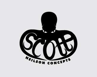
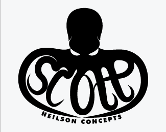
This is my new idea for my logo, I wanted to keep the octopus because I love him too much to throw him away.
I wanted something a lil more interesting to look at and more down to earth as my old logo looks WAY to corporate.
Really looking for crits on this please ?? :)
Status:
Work in progress
Viewed:
2919
Tags:
scott
•
neilson
•
logo
•
octopus
Share:





Lets Discuss
Clever and definitely unique.Maybe some pupils for the eye? Also scale the whole thing down within the presentation area.
ReplyThanks, I still need to do some serious tweaking on it. I\'ll hopefully have an update soon
ReplyGreat concept. Just an idea. It will probably be too small but what if, you add highlights with the sucker would be on the tentacles? I like it though. Great job.
ReplyHe SL I REAAAALLY wanted to add lil suckers onto him but your right it was just too detailed :(
ReplyI would curve just the tip of one of the encircling arms/tentacles down between Neilson and Concepts so the text is just a little more integrated. Also, it may be just my eyes, but Neilson Concepts looks like it is off to the left a little.
ReplyI think this is a cool logo. I like the octopus and the look in his eyes especially. The only critisism is that the way the legs look as they spell Scott seems too cartoonish.
ReplyIf it was aimed at kids market or some fun type of client then it\'s probably OK but it reminds me a little of a scooby-doo character or something.
I think it\'s the way the legs end up pointy. Maybe they could have suckers to spell the name somehow?
Please login/signup to make a comment, registration is easy