Float
(Floaters:
9 )
Description:
a store for everything that has to do with birds
Status:
Nothing set
Viewed:
8711
Share:




Lets Discuss
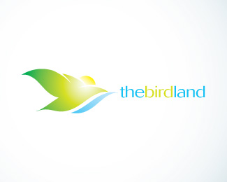
Not sure about name positioning, but I like the touch here very much... Touch-much... TM? ?!?!? :)
Replythe mark is very nice. the type seems a bit cramped compared to the free-spiritedness of the bird. Track the type out a bit and soften the blue of the type and you have something really nice here.
Replythx guys for the comments ill try something out for the font,
ReplyI really like it a lot, but the white glow is really washing out your beautiful mark. Maybe soften it up?
Replythe word 'bird' falls away too much because of the color. use a bit stronger green from the bird image. take out the white spot in the bird image. that white in the gradient takes overshadows the great shapes.
ReplyGreat symbol, very nice mark!
ReplyGood Work Nadim
ReplyPlease login/signup to make a comment, registration is easy