R—Я Tourist logo Russia
by naum • Uploaded: Feb. 03 '16

Float
(Floaters:
1 )
Description:
Situation:
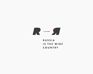
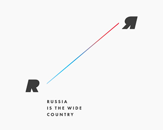
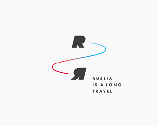
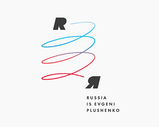
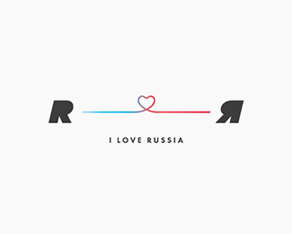
Russia is the most extensive country in the world Its length from west to east is more than 10 000 kilometers This distinctive quality I have taken as a basis for designing a logo
Decision:
Line Feed - basic constant of the logo symbolizes the width of this great country, or her coverage Also, the logo can be filled with different subject - to take the most different shape and arrangement through modification of only one element - the line feeds, while maintaining its visibility
The logo is also the international bilingual, as evidenced by the stylized Latin - R and Cyrillic - The letters Ya graphically brothers are mirror that magnifies the effect of convergence and international spirit
There is a flexible tool that provides ample opportunities for rendering virtually any Russian tourist image, from simple to complex
Status:
Just for fun
Viewed:
980
Tags:
Blue
•
Red
•
Black
•
Cyrillic
Share:
Lets Discuss
Please login/signup to make a comment, registration is easy