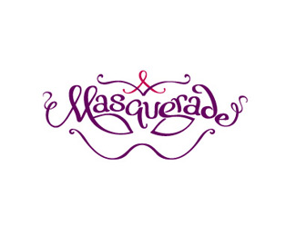
Masquerade
by muse7 • Uploaded: Dec. 27 '09

Float
(Floaters:
7 )
Description:
Custom type, enclosed in a mask and topped with a red AIDS ribbon
Status:
Client work
Viewed:
3697
Share:


Lets Discuss
This has great potential but it's sitting on the fence now. I'd either go for more refined thicks and thins for a more polished look OR push the hand drawn element for a looser feel. Right now it's in between. Play with it!
Reply%5EWhat Glen said.
Reply%5E%5E%5E Ditto.
ReplyThanks logoboom, logomotive, absoludicrous, Houston-we, and Ocularink.*I posted a revised but I'll revisit it with fresh eyes tomorrow.
ReplyI was getting feedback from people at work that the M wasn't reading as an M but as a S and an L. So I simplified the M. previously http://logopond.com/gallery/detail/88697 Is there any question now.
ReplyLooking good. Anyway that %22on the mall%22 can incorporate into the empty space above the nose? I think the fuller the mask is the better because it feels like ornate filegree etc.
ReplyThanks for the feedback logoboom and David. The addition of color adds depth and fills out the mask.
ReplyI like David's comment. It might look good centered. I do like the new pattern in the background. Nice!
ReplyI agree with David and Glen. On the mall, positioned as it is now throws this off, just enough to make it less than perfect. Love the direction you went with this though. :)
ReplyDave, Glen and Chad - Your wish is my command.
ReplyLooking good. My favorite logo of yours.
ReplyThank you so much Firebrand, I appreciate the encouragement and float.*Thanks for the floats Dalius, Glen, Jared Lunde, Michael Spitz, David, Jacob and Chad *
ReplyPlease login/signup to make a comment, registration is easy