Description:
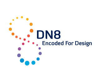
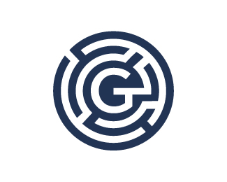
This is a logo for a web designer/programmer. I was going for a strand of DNA meets the number 8. Let me know what you think.
Status:
Nothing set
Viewed:
1648
Share:


Lets Discuss
I find this very colorful and simple. Good job.
ReplyThanks. Simple is good.
ReplyI would downsize the mark for about 50%25... Name and mark need more balance here... Nice idea, though...
ReplyNice idea. I've updated the logo. Thanks!
ReplyPlease login/signup to make a comment, registration is easy