Float
(Floaters:
1 )
Description:
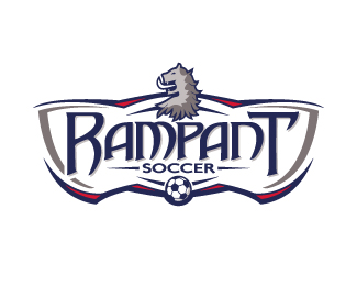
Identity for Philadelphia area Youth Soccer School
Status:
Client work
Viewed:
1988
Share:


Lets Discuss
The type and border treatment are cool. It might be nice to take the little spike on the crossbar of the T and repeat it on the top of the R to give the logo more balance. However, I think the animal/creature still needs work as I'm not exactly sure what it's supposed to be (a dragon?). I also think that its head should face the other way - it looks a little odd having it face to the left as we naturally read from left to right.
ReplyThanks for the feedback, sdijock. This one is already is use but I like the idea about adding the accent to the %22R%22 for balance. Actually, the creature depicted in the bust at the top is actually known as the %22Lion Rampant%22. The client wanted to include it as shown in Scottish royal flags of the past. Hard to describe - I agree it looks like a mix of some sort of dragon and a lion, almost like some sort of crazy gargoyle.
ReplyPlease login/signup to make a comment, registration is easy