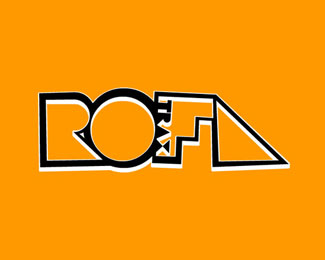
ROFLtrax
by mrSimon • Uploaded: Jul. 31 '09

Float
(Floaters:
0 )
Description:
This is my second logo for my netlabel ROFLtrax. I wanted to completly depart from the style of my first logo, whilst roughly retaining outline of the original 'R'.
After experimenting with differnt primative shapes, I ended up with this. I chose to ride with it as its quite bold, something you could perhaps slip on the back of a CD cover. In addition, I think it works quite nicely, as it looks like a disc or vinyl in a unique kind of sleeve.
In animated promos, I intended to play with the idea of a grid of triangles, flashing like strobe, then revealing this logo, with the semi-circle, spinning to a halt like a turntable.
As seen on:
ROFLtrax.com
Status:
Just for fun
Viewed:
1031
Share:
Lets Discuss
Please login/signup to make a comment, registration is easy