Float
(Floaters:
3 )
Description:
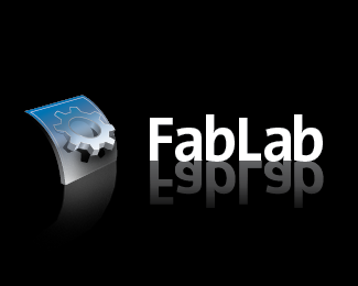
Logo for a educational fabrication laboratory for kids.
Status:
Nothing set
Viewed:
4319
Share:
Lets Discuss
The reflection is taking away from an otherwise promising logo.
ReplyHmm. You're right. Should I take it away from the type or the icon or both? Or just tone it down to a very subtle level?
ReplyI'm going to agree with TernaciousT on that one. IMHO, reflections are starting to become way overused and add nothing (and maybe take away from) 95%25 of logos.
ReplyTake it off both, and try a few colour variations on type and icon. Forget reflections in general unless ofourse your doing a brand for a company that specialises in glossy black tables...then its a must! %3B). Look forward to seeing your showcase as it grows.
ReplyOK you guys are going to hate me, but I like the reflection! Keep it!
ReplyNice logo, sucky reflection. The way I think of it is that all elements of a logo have a very particular and calculated purpose, the reflection, in this case, does nothing for the logo. Get rid of it. Otherwise it's a nice mark.
Replythas really nice work
ReplyPlease login/signup to make a comment, registration is easy